Recasting Culture Talk Through Editorial Design

Our partnership with INTACH led to Virasat, a quarterly publication bringing voices, research, and lived traditions into a cohesive, credible format attuned to global audiences.

CLIENT
INTACH
PROJECT
Print Design | Publication

Virasat, the quarterly newsletter of the Indian National Trust for Art and Cultural Heritage (INTACH), brings together its work in heritage conservation, cultural practices, and community  initiatives.Showcasing the depth and rigour of INTACH’s research, Virasat was designed with a visual language that reflects its sobriety and intellectual value.

Our approach used print as an immersive medium with thoughtful layouts, and nuanced typography to transform heritage into a visually sensorial experience. Presented in a feature style magazine-layout, Virasat elevates documentation into discourse, enhancing accessibility, credibility, and engagement for global audiences. Thoughtful design & content structuring brings clarity to the complex narratives, honours diverse voices, and ensures heritage knowledge is communicated with dignity and coherence.

Elevating heritage knowledge through clarity, coherence, and meaningful visibility.

—

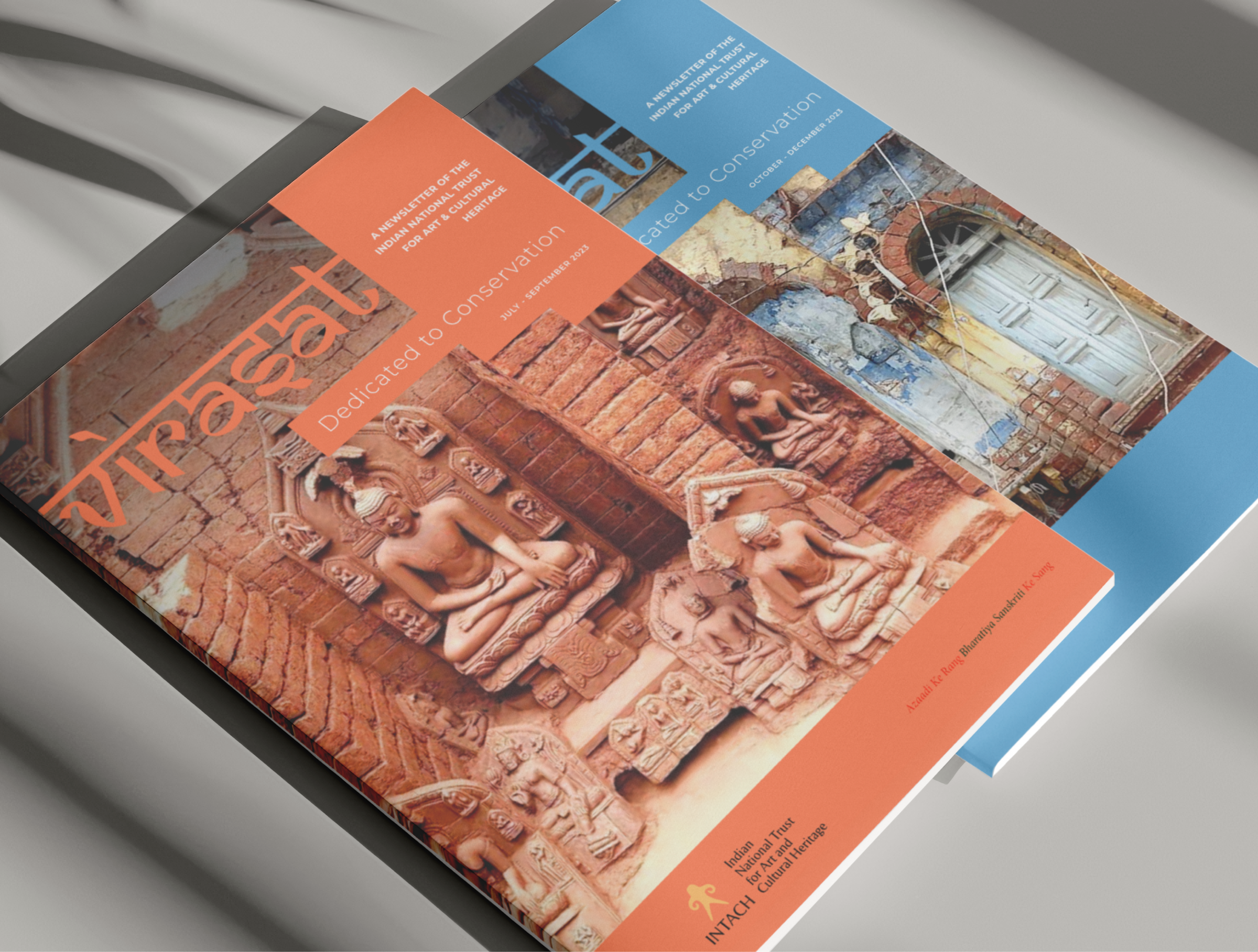
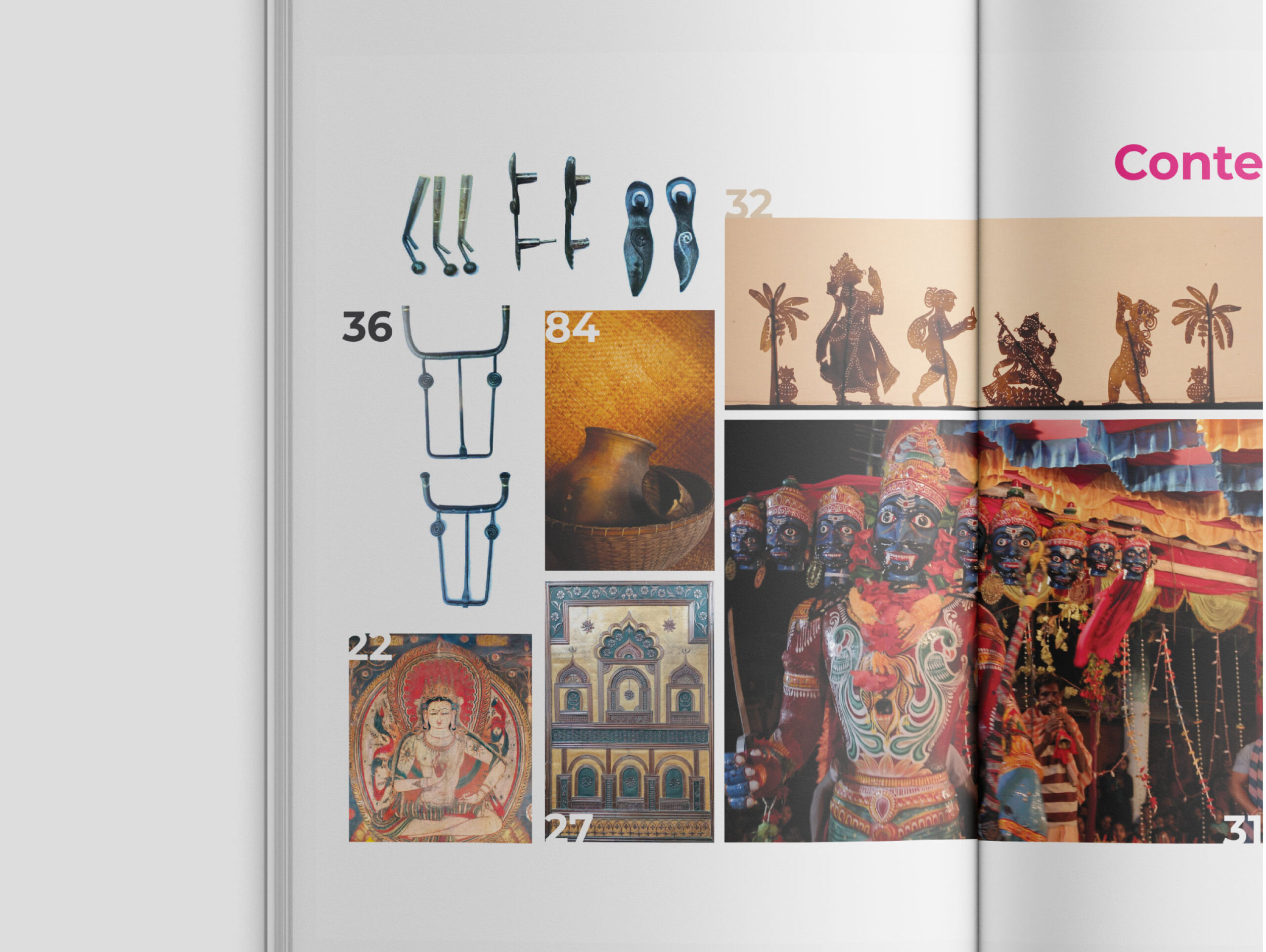
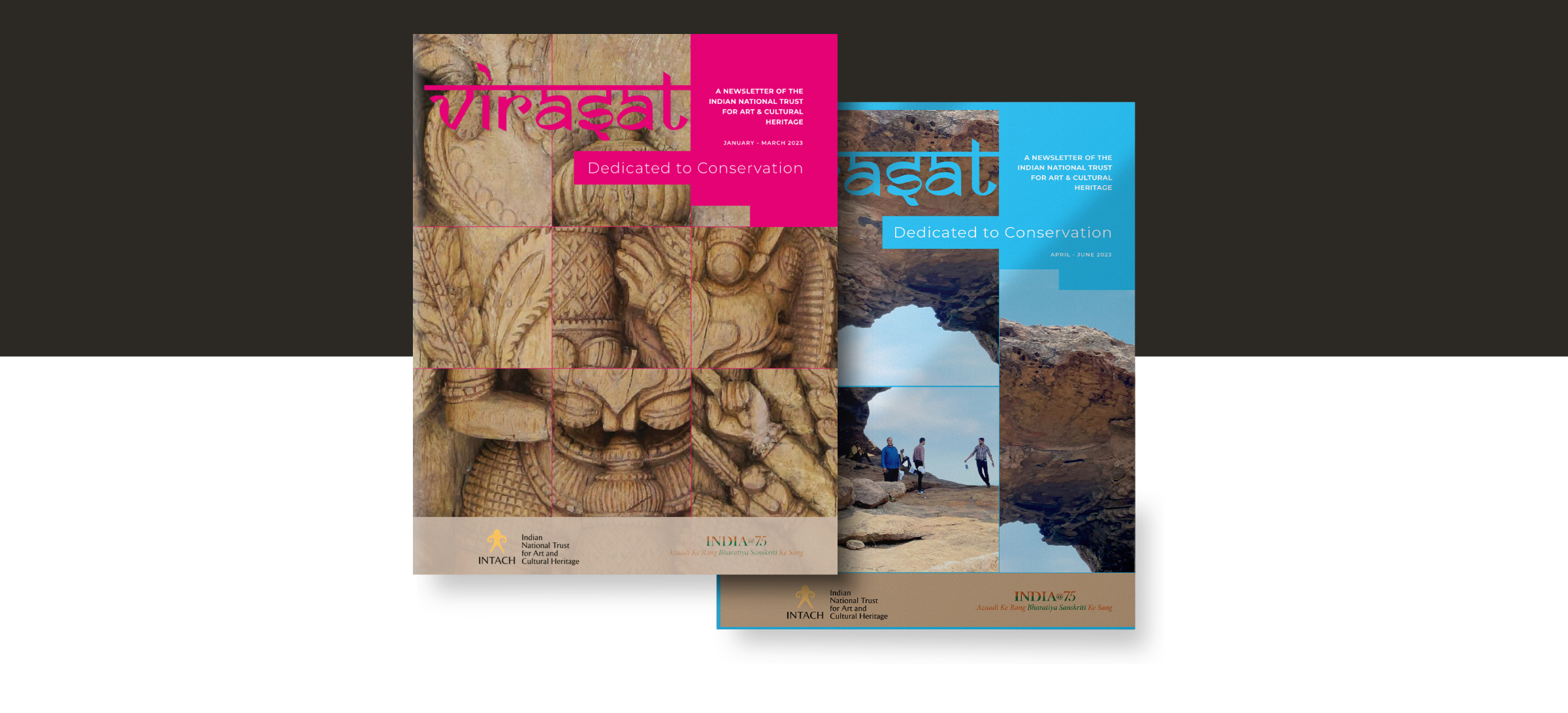
The cover design had a single heritage image fragmented and reassembled, suggesting the whole while withholding it, inviting closer engagement and discovery.

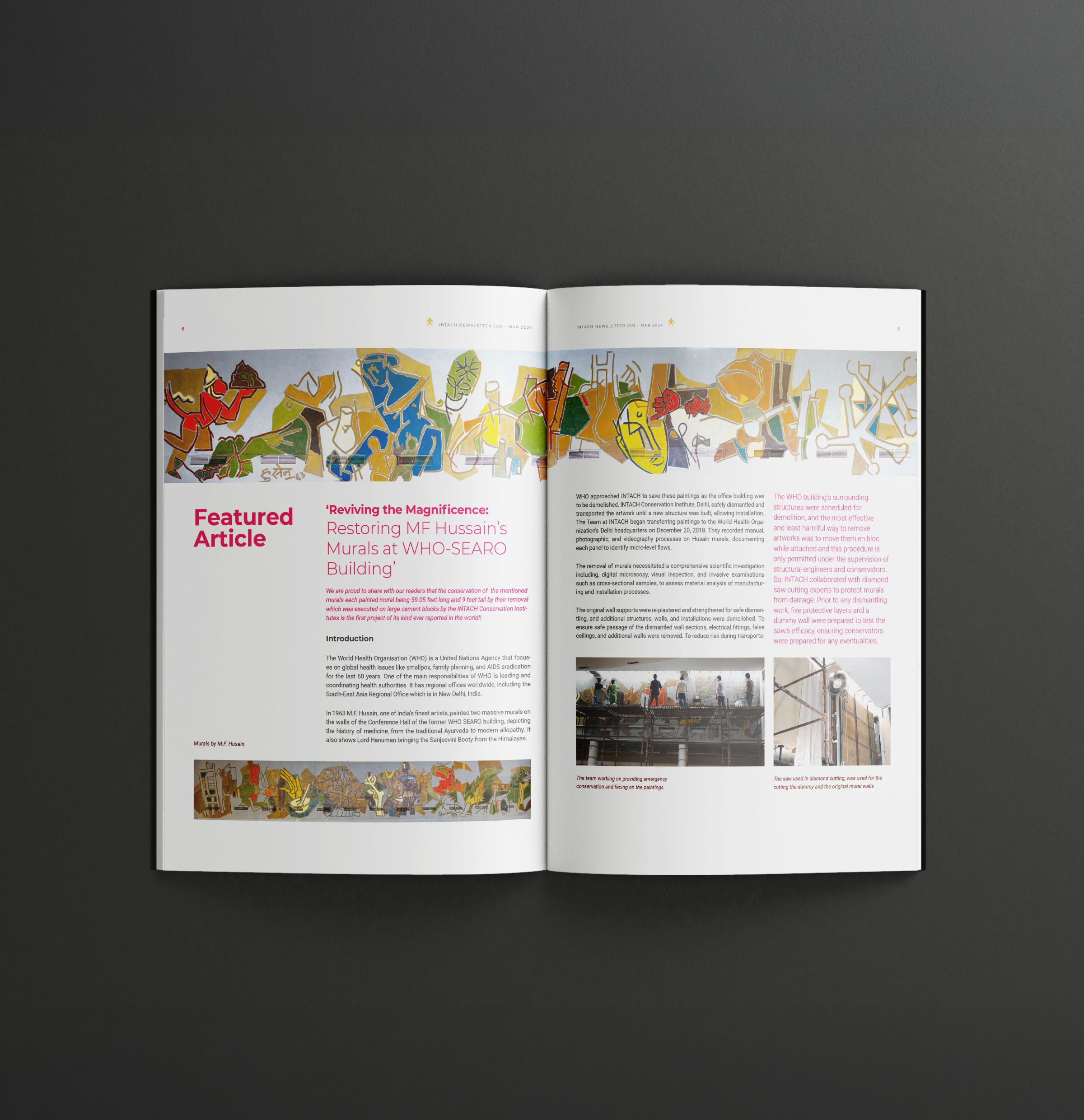
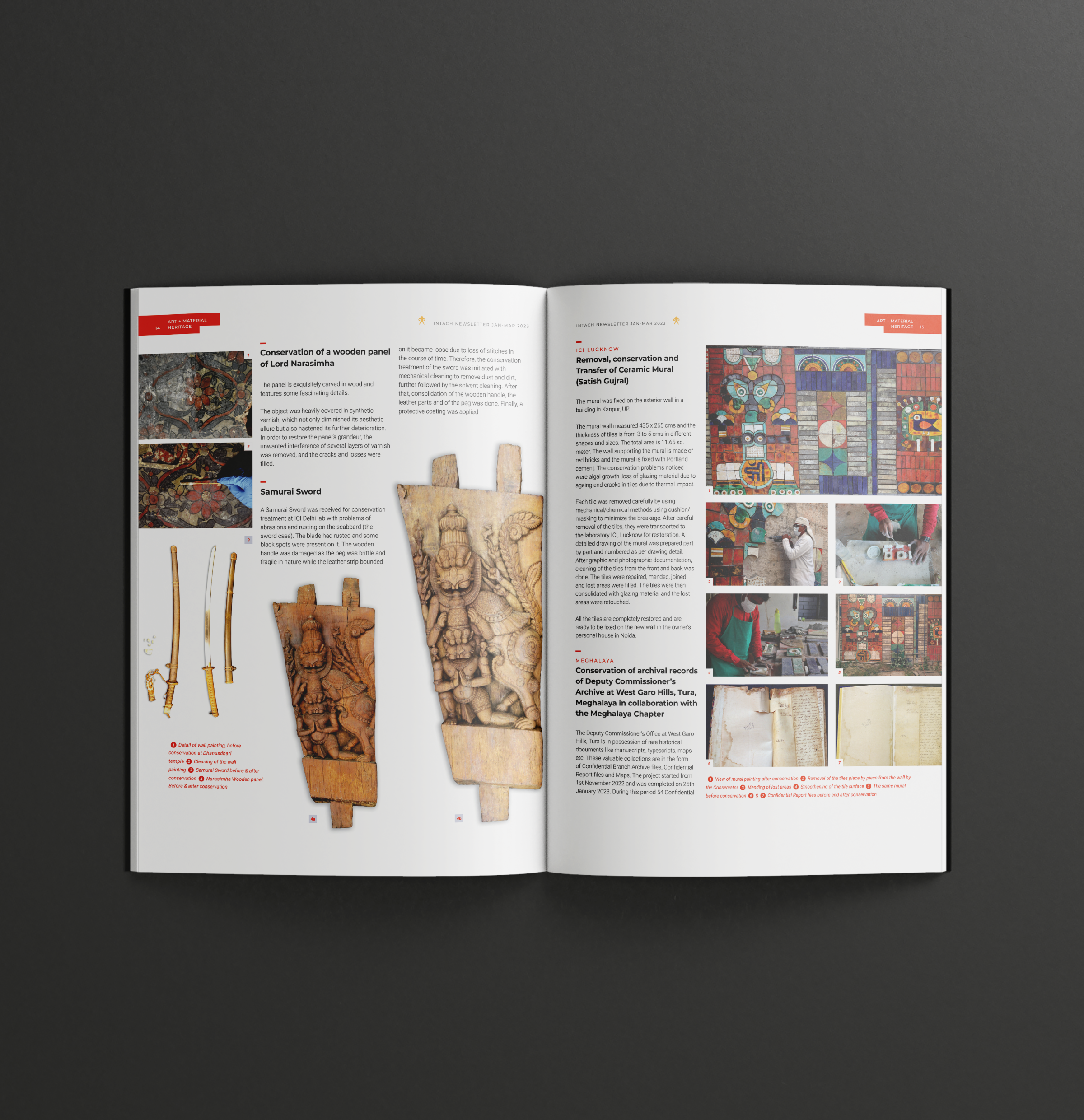
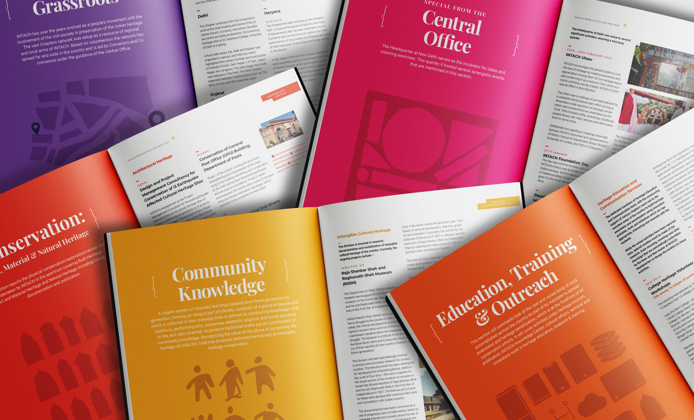
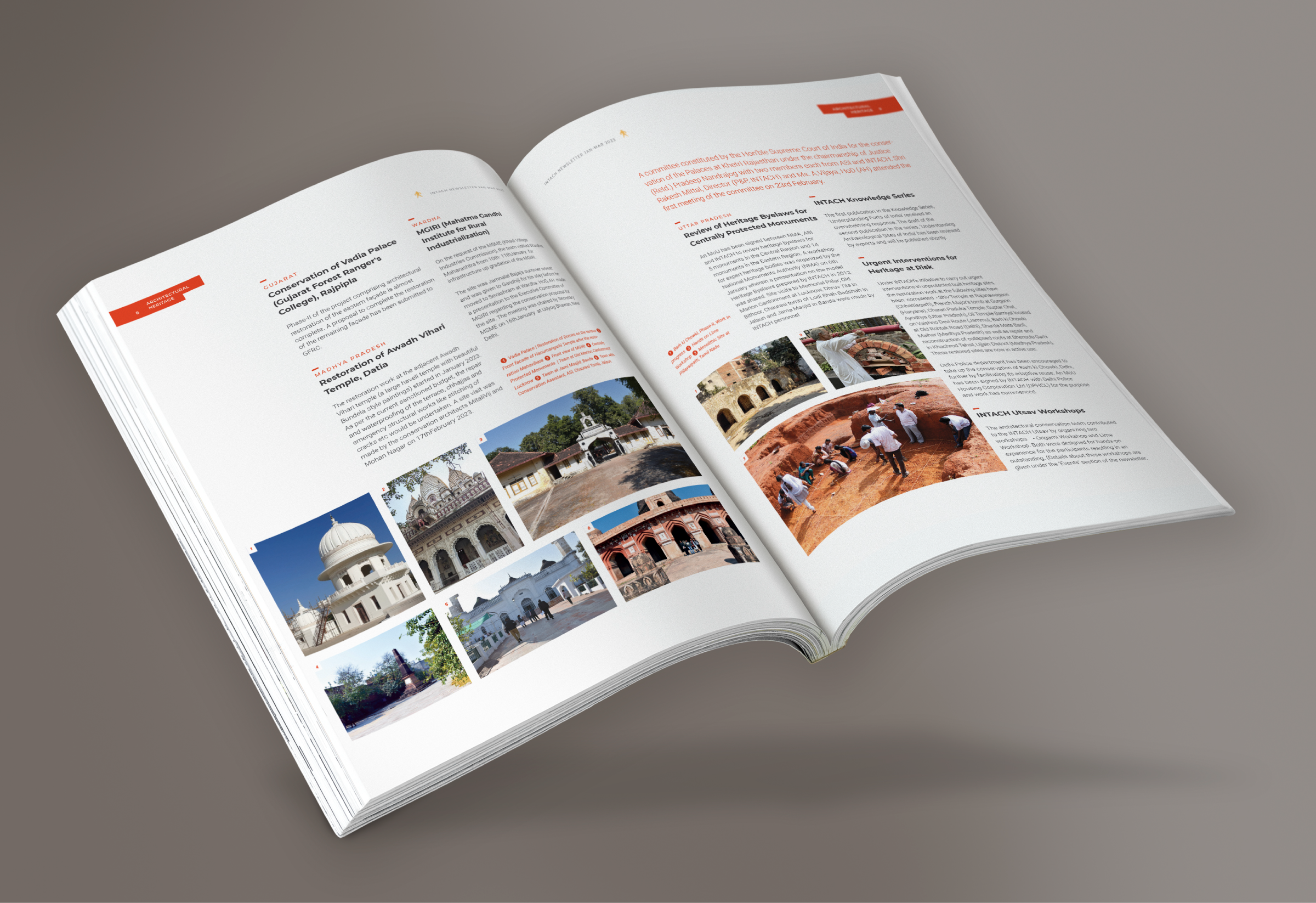
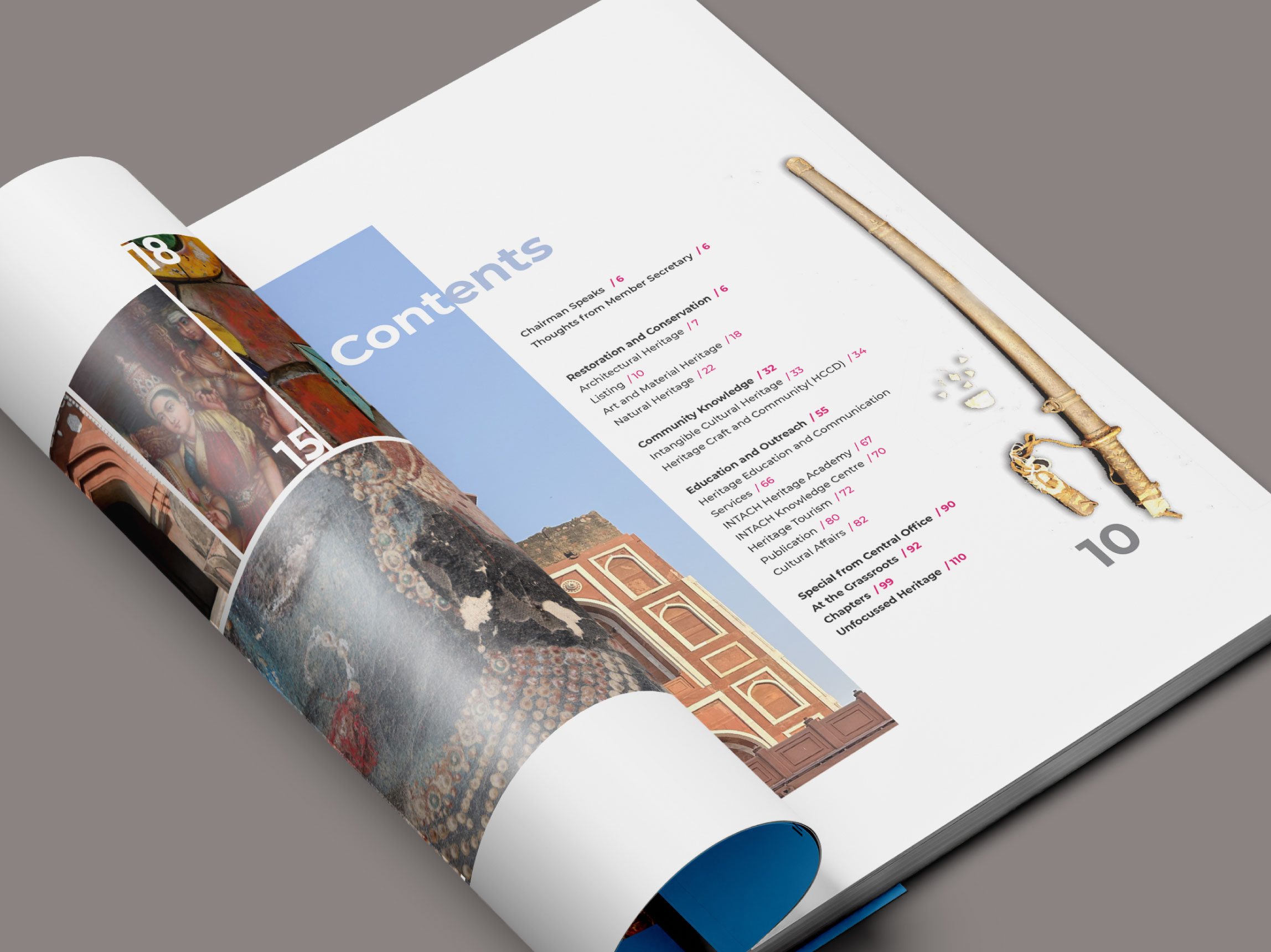
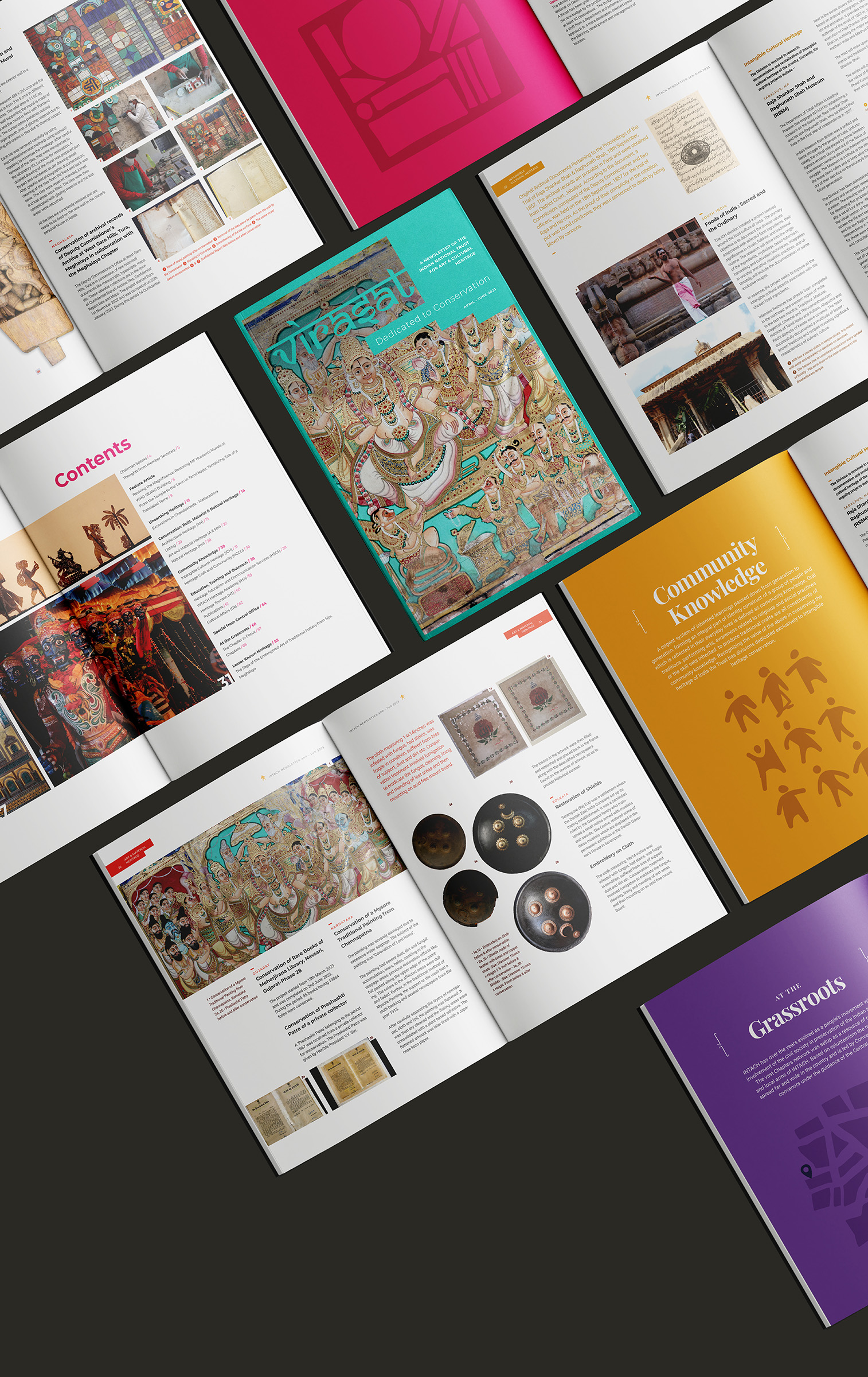
A three-column grid structured the layout across pages, ensuring clarity, consistency, and a clean visual hierarchy.